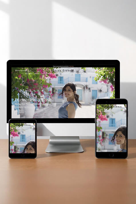
Mobile-First Design
With mobile traffic accounting for the majority of global web usage, it’s essential to prioritize mobile-first design. Ensure your website adapts smoothly to various screen sizes by using responsive design techniques. This includes optimizing buttons and links for touch navigation, ensuring text is legible without zooming, and designing layouts that make the mobile browsing experience as fluid as on desktops.- Why mobile-first design is essential for SEO and user engagement: Mobile-first indexing by Google prioritizes the mobile version of your website for ranking, meaning a poorly optimized mobile experience can hurt both user engagement and SEO.
- Best practices for touch-friendly design: Focus on large, easy-to-tap buttons, avoid hover-based navigation (which doesn't work on touch devices), and ensure forms are easy to fill out on small screens.
- Tools for testing mobile responsiveness: Use tools like Google’s Mobile-Friendly Test or BrowserStack to simulate your website across various devices and screen sizes.
Fast Loading Times
Page speed is crucial, as users tend to abandon sites that take more than a few seconds to load. Optimize image sizes, use modern image formats like WebP, implement lazy loading, and minimize unnecessary code to ensure your site loads quickly. Tools like Google’s PageSpeed Insights can help you identify areas for improvement. A faster website improves user satisfaction and can also positively impact SEO.- The impact of load times on bounce rates and conversions: Studies show that even a one-second delay in page load time can reduce conversions by 7%, highlighting the direct relationship between speed and revenue.
- Techniques like lazy loading and deferred JavaScript: Lazy loading ensures that images and videos are loaded only when the user scrolls to them, speeding up initial load times. Deferring JavaScript means scripts load after the page content, preventing delays.
- How to leverage Content Delivery Networks (CDNs): CDNs distribute your website’s data across various locations globally, reducing the time it takes to load content by serving it from the nearest server to the user.
Intuitive Navigation
Easy-to-understand navigation is one of the most important aspects of UX design. Create a logical site structure with well-organized menus, a search bar, and breadcrumbs to guide users through the site effortlessly. Avoid overwhelming visitors with too many options. Instead, aim for simplicity and clarity to help users find what they’re looking for without frustration.- The role of user journey mapping in navigation design: By mapping out the user’s journey through your site, you can identify key touchpoints and make navigation more intuitive, ensuring users can access important information with fewer clicks.
- How to avoid overcrowded menus and excessive drop-down options: Simplify the menu by grouping related content under broad categories and limiting the number of items to avoid overwhelming users with too many choices.
- The benefits of sticky navigation bars and breadcrumb trails: Sticky navigation bars keep the main menu visible as users scroll, improving accessibility. Breadcrumb trails show users their current location within the site, helping them navigate back easily.
Effective Use of White Space
White space, or negative space, is the area around design elements that gives content room to breathe. Proper use of white space improves readability, draws attention to important elements, and makes the overall design look cleaner and more professional. Don’t be afraid of leaving areas of your page empty—it’s a powerful design tool that enhances user focus and experience.- The psychology of white space in improving content focus: White space reduces cognitive overload by breaking up content and making it easier to digest. It draws attention to key elements such as headlines, images, or CTAs, enhancing clarity and focus.
- Balancing minimalism with functionality: While a minimalist design is appealing, avoid sacrificing essential information or functionality for the sake of space. Ensure that necessary content is still accessible, and don’t leave users searching for basic features.
- Examples of famous websites that use white space effectively: Brands like Apple and Google are known for their clean designs, where white space is used strategically to highlight products, guide the user’s attention, and create a sophisticated, modern aesthetic.
Strong Call-to-Actions (CTAs)
Your website’s Call-to-Actions (CTAs) play a pivotal role in guiding users toward desired actions, such as making a purchase, signing up for a newsletter, or contacting you. Ensure that your CTAs stand out by using contrasting colours and clear, action-oriented text like "Get Started," "Learn More," or "Buy Now." Placement is also key; make sure CTAs are visible without disrupting the user experience.- How the colour of your CTA button affects conversions: Colour psychology plays a big role in how users respond to CTAs. For example, red evokes urgency, while green represents "go" or action. Using contrasting colours ensures your CTA stands out against the rest of the design.
- Strategic placement of CTAs on landing pages and product pages: CTAs should be placed above the fold (the part of the page visible without scrolling), but also repeat throughout the page to capture users at different points in their journey.
- A/B testing for optimizing CTA performance: Test different variations of CTAs (text, colour, placement) to see which perform better. This data-driven approach helps refine CTA design to maximize conversions.
Accessibility Features
Ensuring that your website is accessible to all users, including those with disabilities, is both a moral and legal obligation. Incorporate features like alt text for images, proper heading structure, keyboard navigation, and screen reader compatibility. Not only does this enhance the experience for all users, but it can also improve your search engine ranking, as search engines favour accessible sites.- An overview of WCAG (Web Content Accessibility Guidelines): WCAG provides international standards for making web content more accessible to people with disabilities. These guidelines cover everything from text alternatives for images to ensuring proper contrast and keyboard navigation.
- Common accessibility mistakes to avoid: Errors like missing alt text, poor contrast ratios, and not providing keyboard navigation can prevent users with disabilities from fully accessing your site. Regular audits and tools like WAVE or Axe can help you identify and fix these issues.
- How to make forms, buttons, and interactive elements accessible: Ensure forms are labelled correctly for screen readers, buttons are large enough for touch navigation, and all interactive elements have focus states to guide keyboard-only users.
Interactive Elements
Adding interactive elements like animations, sliders, and hover effects can make your website more engaging. However, be mindful not to overdo it. Keep animations subtle and purposeful, enhancing the user experience without overwhelming visitors. Interactive features, when done right, can highlight important content, make the browsing experience more dynamic, and guide users’ attention naturally.- The balance between aesthetics and performance—avoiding excessive animations: Overusing animations can slow down your website and distract users. Keep animations subtle and meaningful, such as using hover effects to indicate interactivity or transitions to guide users smoothly through actions.
- How micro-interactions (e.g., button hover effects) enhance UX: Micro-interactions, like a button changing colour on hover, provide immediate feedback to users, improving their experience and guiding them intuitively. These small touches can make interactions feel smoother and more engaging.
- Tools and frameworks for adding interactive elements: Use lightweight frameworks like Lottie for SVG animations or CSS transitions for simple hover effects. These tools help you create engaging interactions without compromising load times or performance.
At The Whole Digidoodle, we specialize in crafting responsive web designs and delivering top-notch graphic design services that enhance user experience across all devices. Contact us today to learn how we can create visually stunning, mobile-friendly solutions tailored to your business needs!


