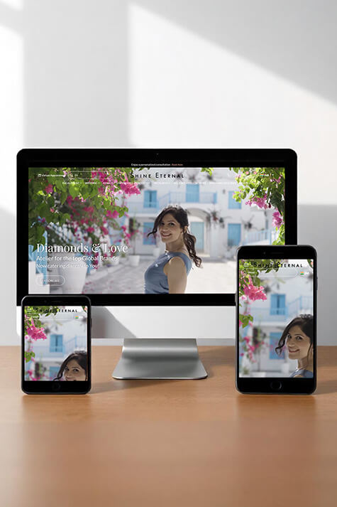
<span>Responsive</span><strong>Design</strong>

ResponsiveDesign

Hire The Whole Digidoodle's responsive web design services to make your non-responsive website mobile friendly. Hire expert web designers at half the cost of other responsive website design companies to ensure your website looks great on all devices & platforms and doesn't irritate users with a poor experience. Book an appointment today!

Why Choose Responsive Web Design?

With the growing number of users accessing the internet on mobile devices, it’s crucial that your website is fully responsive. A responsive design improves user experience, reduces bounce rates, and enhances SEO performance by providing a consistent experience across all platforms. Choosing a professional responsive website design company ensures your site meets modern standards.

Let’s Create Something Amazing Together

At The Whole Digidoodle, we are passionate about delivering high-quality responsive web design services that help your business thrive in the digital world. Whether you’re looking to redesign an existing site or create a new one from scratch, our team is here to help. Let’s work together to build a website that looks fantastic, works flawlessly, and drives your business forward with responsive webdesign that performs across all devices.

Why Choose Us

Benefits of Working with The Whole Digidoodle

Fast loading website
We ensure your responsive website design is fast, user-friendly, and engaging—creating a lasting impression on visitors and attracting more sales.
Professional & appealing
Professional-looking websites with eye-catching layouts, images and responsive design are built by our web designers to help your business generate more leads and sales.
User-friendly
To make a good impression on visitors, we ensure your mobile friendly website design allows users to easily find information or make purchases quickly and effortlessly.
Search Engine Optimized
Understanding search engine algorithms and strategy, our web designers can create responsive website design services that are fully SEO-optimized to help you rank better and faster than other methods.
HTML and CSS3-based
For excellence in responsive web design, we use high-end tools such as HTML5 and CSS3, Photoshop 21, Dreamweaver, etc., to ensure peak performance.
Web 2.0 based
We’ve upgraded our design approach to include only advanced, dynamic, and creative Web 2.0 technologies, helping us build timeless and mobile friendly website design experiences.
Challenges and Goals
1
Ensuring that a website looks and functions consistently across various devices and screen sizes can be challenging. Each device may require different layouts and adjustments, which demands careful design planning and testing.
Design Consistency
2
Aim to create a responsive website that loads quickly on all devices. This involves optimising images, leveraging caching, and minimising code to ensure fast, efficient performance.
Optimised Performance
3
Ensure that the website is accessible to all users, regardless of the device or browser they use. This includes adhering to web standards and accessibility guidelines.
Broad Accessibility
4
Develop a responsive design that adapts to future technological advancements and varying screen sizes, ensuring longevity and relevance for years to come.
Future-Proof Design